Category Archives: Writings about Art

Bob Mizer at 80WSE Gallery

I had not been aware of Bob Mizer’s photography until coming across two reviews. After reading them, I headed over to see DEVOTION: Excavating Bob Mizer exhibit at 80WSE Gallery. The press materials notes he was a pioneer in the Beefcake genre of photography. An internet search reveals that these sexually suggestive male nude photographs were distributed primarily through the mail and in the publication Physique Pictorial. While “cheesecake” risque’ nude photographs of women had long been available to stoke the heterosexual male libido, male homosexual desire, being suppressed by cultural intolerance, would have difficulty finding a ready source for homoerotic art and photography.  Bob Mizer’s photography catered to those desires.

The industry of Bob Mizer is inarguable. He is credited with making 3000 films, and the full depth of his still photo archives has have yet to be fully plumbed.  The press release would have us believe that Mizer is an “enigmatic American photographer; arguably one of the most compellingly prolific cultural documentarians of the 20th century”. To my mind, the work hanging in the gallery is neither documentary nor compelling. There’s no enigma, either: the male models pose to reveal as much of their anatomy as permissible by obscenity laws, their genitalia concealed by a g string. Intended to fully reveal the musculature of the body builder models, poses range from stilted to laughable. A recurring motif are buff hunks wearing nothing but cowboy boots and/ or cowboy hats. A variation are two bare chested cowboy-hatted models, self consciously posing face to face while at the same time licking the muzzles of toy cap guns.

Beefcake vs Cheesecake

Beefcake vs Cheesecake

The same sorts of props and poses can be found in cheesecake imagery.  At 80 WSE galleries, a few ‘conventional’ portraits can be found– and they are simply conventional. Also hanging is  a staged photograph of young men working on an automobile. Similar illustrative images could be found in car magazines of the era. Beyond a gay man’s libido, there is little stimulation to be found in Mizer’s work.

Contrast Mizer’s work to George Platt Lynes: Lynes, an accomplished editorial and commercial photographer who faced the same taboos against homoerotic imagery, albeit at an earlier time. Taking inspiration from classical sculpture, surrealism and avant garde art of the 1930s, Lynes’ men were rendered in rich black and white tones that strongly delineated the male form while at the same time portraying a subtle sexual energy.

George Platt Lynes

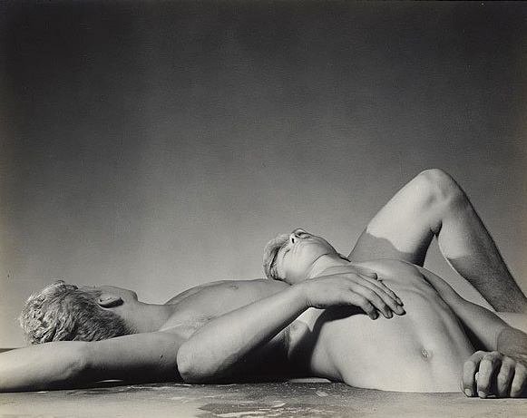
George Platt Lynes – Two Sleeping Boys, 1941

That Bob Mizer is being pronounced an undiscovered artist of a bygone era is familiar phenomena of these times. Not to say that the canon is fixed for all time, but in the 150 years since photography’s invention,  the works of the great photographers have been widely seen in museums and print. In dredging the river of photographic imagery, connoisseurs of the medium are now serving up all sorts of material made for some illustrative purpose which we are now being encouraged to interpret as art.

Consider the 2008 International Center of Photography exhibition of a Fort Worth, Texas photographer, Bill Wood, who worked from 1937-73. The images of that show depicted small town events, car dealerships and grand openings of local stores.  And there lies the attraction for  many of the photographs that are being shown as newly found masterpieces. Whether it be the nostalgic qualities of vintage clothing styles or the stiffly posed studio portraits brought about by the slow and methodical practice  of large format film plate photography, old photographs have an undeniable charm. But when made, Wood’s photographs were ordinary and lacked the invention and particular vision of recognized and celebrated photographers of the day.  As windows on to another time the images of Wood are quirky and curious. Defined and sensitive interpretations of their subjects, they are not.

Bob Woods

Bob Wood

Excavating Bob Mizer’s work any further is unlikely to reveal any greater depth than that of typical erotic photography. Today, these mid century nude photographs may seem amusing, but they function on the same level as any pornography and as such there is nothing more than meets the eye.

Emmet Gowin at Pace/MacGill Gallery

With the exception of a few practitioners (for example, Michael Light and David Maisel, both discussed in this blog), the attraction of aerial photographs seems subject matter driven. Photographers and audiences alike seem satisfied with the bird’s eye view of the landscape we usually see at eye level. The typical aerial photographs exploit the regular sense of design, pattern and bright colors of the built environment- urban canyons, suburban tract housing, sinuous concrete highway interchanges, majestic mountains and amber waves of grain. These predictable images abound in the archives of Stock Photography agencies and on the internet. Aside from the overhead viewpoint, these photograph offer little stimulation.

© Getty Images

© Getty Images

In contrast to the forgoing, Emmet Gowin’s aerial photographs, which he began in the mid 1980s remain revelatory. The power of these toned black and white photographs of the scarified land of nuclear test sites is not because the images show novel perspectives of familiar scenes from unfamiliar perspectives. Instead, it was Gowin’s use of the expressive qualities of the silver print that created imagery that transcends description.

gowinbw

Emmet Gowin. B&W Aerial Photographs.

While the monotone view of black and white photography is intrinsically abstractive and Gowin’s mastery of the medium has always yielded imagery distinctively his own, with the new work he has forsaken the distinctive practice for which he is best known, choosing to work with a digital camera and in color. That digital photography can with ever increasing fidelity depict the world, makes it ever more a challenge to make images which impart more than a representation of what was in front of the lens; in Gowin’s hands a digital camera has produced color studies of Andalucia that are as eloquent as his black and white work.

The textures and colors and gradient tonalities of these new landscapes are unexpectedly engaging. In the photo “Montes Occidentales, Granada, Spain,” regularly spaced trees planted across a sloping hillside inexplicably appear both as dimples or nubs. Scale in this work is baffling: the much larger trees of the irregular woods surrounding the orchards look more like moss than forest. The orchard trees look more like bushes.

Emmet Gowin. "The Montes Occidentales, Granada, Spain, 2012"

Emmet Gowin. “The Montes Occidentales, Granada, Spain, 2012”. Courtesy of Pace/MacGill Gallery.

The intricate details of Gowin’s photographs invite close inspection, and the rewards are delightful. “The Guadix-Baza Region, Granada, Spain, 2012”, a study in brown and tan depicts a landscape after tilling. The randomly shaped lots divide the photographic frame into a patchwork of striated browns and tans. Unlike everyone’s favorite- vast, flat american farm land grooved by the harrow disk, the irregularly inscribed lines of this image and the shadows of clouds dappling the land all make for an ambiguous reading of the lay of the land. This is particularly so within the center of the image where the the scroll-like contours of the lot can be seen as a scrunched up area rug.

Emmet Gowin. "The Guadix-Baza Region, Granada, Spain, 2012"

Emmet Gowin. “The Guadix-Baza Region, Granada, Spain, 2012”. Courtesy of Pace/MacGill Gallery.

“The Montes Occidentales, Granada, Spain, 2012” employs a more vibrant pallet. Made in early morning or late in the day, the raking sunlight created long shadows behind the trees and within the low spots of a rolling terrain. The image is diagonally bisected by a meandering road, blue in color. The lower portion of the photograph, a matrix of textures and pattern, the upper section impressionistically mottled in what look like dustings of colored powders, yellow, greens, whites and browns.

Emmet Gowin. "The Montes Occidentales, Granada, Spain, 2012"

Emmet Gowin. “The Montes Occidentales, Granada, Spain, 2012”. Courtesy of Pace/MacGill Gallery.

For eyes other than Gowin’s I’d think that his subject matter would have appeared rather faded and not particularly interesting; his new photographs are a gorgeous surprise.

Emmet Gowin: Landscapes Andalucia runs until January 4th at Pace/MacGill Gallery.

James Nares at The Metropolitan Museum of Art

Filmed with a high-speed video camera, James Nares’ “Street” is a completely captivating hour-long meditation on the throngs perambulating the streets of New York City. For 16 hours Nares’ camera, mounted in the side window of a van, was trained directly upon the view of sidewalk pedestrians. This particular video camera was designed to film high-speed movement such as rocket launches or explosions with the resulting footage being seen in slow motion. The use of high-speed cameras to create slow motion films can produce extraordinary, if predictable, results. In fact, a whole TV series was devoted to such footage: Discovery Channel’s “Time Warp”, whose viewers were regularly presented with slow motion videos of shaking wet dogs or bursting balloons.

Unlike the fast moving subjects filmed by the “Time Warp” program, the use of the high-speed camera to photograph pedestrian life was inspired. Movement on Manhattan sidewalks is often slow indeed and high-speed cinematography is certainly not required to record the action. And therein is the genius of this project: using slow motion cinematography to record slow movement. In this hour-long film, a streetscape of sidewalks, fire hydrants, no parking signs and storefronts glide past the camera, while the pedestrians appear to be moving extremely slowly or are almost frozen. The effect is of an endless procession of humanity passing across the screen with each figure appearing with startling three dimensionality. Sculptural friezes come to mind: figure upon figure exhibiting every imaginable pose, facial expression, and hand gesture. Some eyes look to the sky, others gaze downward or to something of in the distance. A man’s brow is furrowed, his face a rictus of suffering- or not. His expression frozen, his internal monologue is truly unknowable, but the viewer can imagine. As the camera moves relentlessly forward, new figures come into the frame as other figures pass from view. This procession of humanity is glacial, allowing our scrutiny of every body, but more to the point every face.

James Nares, Street, 2011, HDV, 61 minutes, Edition of 6

We viewers can stare at this spectacular array of human kind passing before our eyes, for what is more fascinating than staring at fellow New Yorkers? We can examine these faces, pondering what thoughts animate their expressions. Although the high-speed camera appears to have stopped people in mid stride, the camera records slowly changing expressions and moving eyes. In one comical interval a woman with large breasts moves across the frame while at the same time the eyes of a man sitting on a stoop behind her can be seen to follow her chest as she moves past him. The possible thoughts suggested by his gaze are few. A moment later both have vanished from our view to be replaced by other fascinating interrelationships.

The moving camera creates a few sublime moments. For an interval, the long procession of pedestrians is at a lull. Not for long: a Michelangelian index finger magically floats into view followed by the thumb and other digits, an arm, shoulder, a face and then a torso. Fixed mid gesture, a man is staring and pointing at something off camera. In another scene a young man in white tee shirt magically pops into view from behind a dark green light pole. The camera moves along with his progress for a moment until he disappears from the screen.

There are other delightful surprises: A man flicks a cigarette, the butt rapidly flies through the air in front of him, scribing an arc across the screen. Another scene shows a bumblebee flying in between statuesque figures. And in another, birds flutter and dart amongst inanimate humans.

“Street“ can be seen as a brilliant counterpoint to Godfrey Reggio’s film Koyaanisqatsi, in which the camera was run at slow speed resulting in footage that was sped up. The film portrayed New York City as an intricate machine run amok. In Reggio’s film, the individuals are expressionless drones speeding across the screen. In “Street”, Nares’ high speed camera depicts slow emotion, offering for our scrutiny a panoply of complex facial expressions which animate the faces of pedestrians.

James Nares: “STREET” (2012) from Paul Kasmin Gallery on Vimeo.

Ken Josephson at Gitterman Gallery

The selection of Ken Josephson’s photographs (circa 1960s-80s) on exhibit at Gitterman Gallery makes the case that his work furthered the genre of modernist photography pioneered by Minor White, Harry Callahan, and Aaron Siskind.

The photographs of Harry Callahan and Aaron Siskind are considered by many to repesent the high point of modernist black and white photography. These artists refined the medium with their expressive, richly toned silver prints. Having both taught for years at Illinois Institute of Technology, their influence endured for several generations. Like Ray Metzker, Josephson studied at IIT, and some similarities can be seen in their work. Both made photographs of the patterns of light under Chicago’s elevated trains. In other Josephson prints, small details such as leaves or bent saplings are rendered as gleaming hightlights emerging from large areas of dark greys and blacks echoing the stark tonalities of Siskind and Callahan.

If there is one characteristic that ties all of these artists together, it is their vision for transformative qualities of black and white photography. Instead of making photographs to faithfully describe subject matter, these artists see the expressive potential of film for making subtle abstractions. With sensitive observation and superb technique, Josephson has built upon these traditions. Take Chicago, 1962: A glowing white bow bisects a rectangle of deep black. With close inspection, the viewer can make out the contour of a hip and an elbow and then realize that what looks like a very reductive line drawing is actually the back of a person wearing an apron.

Ken Josephson. Chicago, 1962. Vintage gelatin silver print

Stockholm, 1967 is another example of Josephson’s sensitively tuned powers of observation. The distinctive contour of a hump backed Volvo B18 is magically duplicated in white on the roadway in the photo’s foreground.  It’s as if the tones of the car’s shadow (which would normally render in dark grey) were printed as a negative. But it’s more clever than some kind of technical manipulation, Josephson simply noticed that a dusting of snow on the roadway had, in effect, become a giant photogram. Likely made soon after the sun emerged from a light snow shower, the pavement warmed by the sun is clear, while the snow shaded by the car’s shadow remains on the ground outlining the contour of the car.

Ken Josephson. Stockholm, 1967. Vintage gelatin silver print

Josephson also adds a playful and experimental attitude to his photograph– as when he drops 4×5” Polaroid prints into the photograph. One such print of denuded trees lays upon the leaf strewn forest floor. Another print depicting the magnificent crown of a tree lays upon a newly sawn tree stump, creating a momento mori.

Ken Josephson.  |  Left: Illinois, 1971.  |  Right: Illinois, 1964.

This practice was explored in a half dozen works hanging at the gallery, with the most sophisticated being Chicago, 1970.  The photograph initially appears to be of gravel taken directly overhead. Within the image of gravel there are what appear to be two frames with gravel contained within. It’s quite perplexing; one struggles to make out just what this is– a mirror like those that Robert Smithson placed in the landscape or are these photograph of rocks?

Ken Josephson. Chicago, 1970. Vintage gelatin silver print

Further examination of Chicago, 1970 reveals that within one of the frames is another frame, and within the other frame are two frames, both cluttered with  heavy gravel stones. It soon becomes apparent that within these frames are three areas where the tones are reversed. It’s an enigma that the artist created by photographing the rocks with an 8×10” view camera, using printing paper instead of film. Processing that paper negative produced a life sized image of the stones rendered as a negative. That print was centrally placed on the gravel, rephotographed using another paper negative, yielding an image of both negative and positive renderings of the gravel.  In turn, this print was placed flat on the gravel adjacent to the the first print which appears to be propped up perpendicular to the ground. Finally the two prints were photographed to produce this confounding image.

Josephson’s explorations of a “frame within a frame” can also be seen in Illinois, 1970, a conventional photograph of a wall covered with asphalt siding. The regular Mondrian-like grid pattern is set off by haphazardly placed patches of dissimilar materials. In a related image, a disembodied hand reaches into the frame placing a white card behind a insect ravaged leaf. The card, in effect, frames and isolates the leaf from the larger background of the forest floor.

Ken Josephson. Illinois, 1970. Vintage gelatin silver print

There is an abundance of stimulating images to contemplate in this show.  Josephson’s work reminds us of a time when photographers showing outside of art galleries were artists nonetheless. A time when a photograph was more than a document. A time before appropriation, a time before identity based art, and a time before colossal color prints.  In their time these practitioners saw photographs as another form of print making where the medium could be exploited for expressive and abstractive results. Modest in size and jewel like in intensity, Josephson’s prints demonstrate a vision particular to this artist and to this period of photography.

(In)Appropriation. The new Academy: Post Modernism and the lack of new insights.

As an artist, I’d like to think that I’m forward thinking enough to accept the many forms and ideas of contemporary art. However, upon walking into Eric Doeringer’s exhibit at Mulherin&Pollard my immediate thought was, “How could this hollow notion be served up again: an art work that is a copy of someone else’s work?

In this case, the artist has copied art that was already a copy of an artwork. A copy of a copy. Among other works, Doeringer’s was presenting his copies of Richard Prince copies of Marlboro cigarette advertisements. It’s the same conceit we saw for the first time in Sherrie Levine’s earliest work, but taken to the next level: if making a copy of art is art, then copying the copy could make another artwork. In a jocular moment, I had the same idea several years ago when viewing “After Rodchenko,” a work “by” Sherrie Levine, which was under consideration for purchase by a museum’s photography committee. In support of this possible purchase, the curator’s presentation pointed out the historical significance of these early appropriated works. Moreover, because the museum had not purchased the work when the prices were lower, she urged the group to buy the work at $80,000.00, before the work became even more expensive. As the group gathered around to examine Levine’s copies of 9 Rodchenko, I took out my pocket digital camera, and after photographing all the images, I mischievously quipped that I would provide copies of the copies for significantly less than $80K.

Left: Sherrie Levine, After Rodchenko, 1987. Gelatin silver print, $15.000
Right: Alexander Rodchenko, Pioneer Trumpeter, 1930. Gelatin silver print, $3995

As I wrote in a previous blog entry, I find little interest in appropriative photography. While I can well appreciate the use of recycled elements of one art to make another art, presenting a direct copy of an artwork as an artwork is one of those art world ideas that seems like a joke to all but art world insiders.  Observing the wealthy photography committee members toting their Hermes Kelly Bags, I couldn’t help thinking: Surely they would never purchase a knock off Hermes on Canal Street. Aside from the conceptual rubric, what is the difference between a copy of an artwork and the copy of a handbag?

Left: Eric Doeringer, Untitled (Cowboys) 005, 2011. Archival inkjet print, $2200
Right: Richard Prince, Cowboy #1, 1992. Price range: $300.000-1.500.000

Left: Hermes Birkin Bleu Bag, $7000 | Right: Hermes Birkin Bleu Replica Bag, $180

As the gallery tells it, “(Doeringer’s) works in this exhibition are all based on pieces originally made by other artists. Doeringer chose to remake these artworks because the originals raise questions of authorship, authenticity, ownership, and the importance of the “hand” of the artist. The artist sees his works as extensions of the earlier works, building upon the conundrums they originally created.”  30 years on, the appropriation gambit, like the press release quote, has become academic.  By now, I’d like to think that the art world would move on to newly invented movements.  For some, the notion still satisfies:  Ken Johnson of the New York Times wrote, “Mr. Doeringer is a late comer to the art-about-art game, a follower in the footsteps of Richard Pettibone and Sherrie Levine. His distinction is his focus is not on canonical works of Modernism but on famous conceptualist pieces that are themselves about art. He is a meta-meta artist.” We can only look forward to a future article praising the artist who replicates Doeringer’s oeuvre.

Not wanting to dismiss an artist based on the impressions of one show, I turned to Doeringer’s website and was amused by a number of the works found there. There is a playful quality in some of his efforts (his satirical Cremaster Fanatic site is very funny), but the “art-about-art game” has become a regular pursuit of graduate students.  Of the various projects found on his site, I think one in particular lets us know where the bar has been set: “The Shit Stream.” The artist characterizes this series as “a blog documenting all of my bowel movements…. I was…interested in the idea that feces is like a little sculpture that we create every day.”

This is no more original than any of Doeringer’s other ideas. In Jules Feiffer’s 1967 darkly satirical play “Little Murders,” the main character [played in the movie version by Elliot Gould] is a photographer who takes pictures of shit. Feiffer was pointing out the art world will elevate just about anything into the high realm of Art, a barbed point which is just as true today as it was a half century ago.

Appropriative photography

Appropriative photography received the art world sanction in the late 1970s when works by Sherrie Levine and Richard Prince were shown for first time in galleries.

Anyone reading this knows that the use of images sourced from newspapers and magazines has long been a tenet of art. Marcel Duchamp is generally credited as the first artist to present as an art object ordinary manufactured objects. Calling things that he selected and signed “Readymades,” Duchamp tweaked the art establishment of his day by titling a urinal as “Fountain” and signing it with the pseudonymous R. Mutt.

As surprising as the notion of the “ready made” may have in its time, the aesthetic qualities of the chosen objects were sometimes quite manifest in their given forms. Although an assault on good taste, the shape of a urinal is not so shocking as a modernist form, and, presented in an art gallery, this object, unlike many other appropriated elements in art, was actually recontextualized. Although Duchamp claimed to have no interest in the visual form of art, back then, it was possible to see a urinal or a bottle rack as sculptural forms. Because of the functional aspect of these objects and the startling concept they posed at the time, these artworks simultaneously posed and answered the question of recontextualization: Could an ordinary object be seen as an art object? Presented as an object, within a gallery, yes, it can be seen as an art object.” Later, Warhol’s outright reuse of newspaper clippings and commercial imagery to make his paintings along with the comic book imagery of Roy Lichtenstein’s paintings furthered the idea that the visual elements of an artwork did not have to originate with the artist.

So, seeing the work of Levine and Prince for the first time, I thought it easy to see it as a reprise of pop art sensibilities. Regarding their work, I’m not going to get very far arguing against an article of accepted faith. Widely exhibited in museums and acquired by powerful collectors, Levine and Prince’s work has been an inspiration to legions of artists. But the questioning of originality that is raised by Levine and Prince’s appropriated photographs is not particularly deep. Simply put, it goes to the idea, “Are there any truly original ideas in art?” Is this a question that really needs much thought? The problem with this question is that it can be answered in a few sentences. I am well aware that thousands of pages have been written about mediation and simulacra and other post modern jargon. For some it makes for good reading, and for others it’s the pro forma of many a gallery press release. To my mind, making art with the rationale that “there are no original ideas, so why not simply present a copy of another artwork?” can be expressed with the making of just one work. Take a photograph of another photograph and frame it- done. Is the idea further explicated by repeating the exercise of copying other works?

All of these thoughts were stimulated after visiting the Douglas Rickard exhibit at Yossi Milo. Born in 1968, Rickard could be seen as the progeny of Levine and Prince had they produced a child together. Similar to Prince’s early work which were copied from the pages of magazines he perused when working for Time Life Publications, Rickard finds his imagery at one source, Google Street View. The gallery press release describes his methodology: “Rickard took advantage of Google’s massive image archive to virtually explore the roads of America…. After locating and composing scenes of urban and rural decay, Rickard re-photographed the images on his computer screen with a tripod- mounted camera…”

On the first count, the work conforms to Post Modern orthodoxy:his subject is mediated rather than actual. The work also conforms to established traditions of straight documentary photography as pointed out by the press release: “Rickard’s work evokes a connection to the tradition of American street photography, with knowing (italics mine) references to Walker Evans, Robert Frank, William Eggleston and Stephen Shore.”

Left: Stephen Shore, Broad Street, Regina, Saskatchewan, 1974
Right: Douglas Rickard, #40.805716, Bronx, NY. 2009, 2011

Left: William Eggleston, Girl in Green Dress Walking Near Minter City & Glendora, Mississippi, 1973
Right: Doug Rickard, #42.418064, Detroit, MI. 2009, 2010

Here, I think, are a few question that have unwittingly been raised by the project:

If a camera mounted on a car can automatically make works so similar to those made by the masters of documentary photography, what does that tell us about the documentary practice? Is there an audience already primed with an interest in “forgotten, economically devastated, and largely abandoned places.” As Shore followed Evans, so too, do many photographers still roam America, searching for ramshackle buildings and dusty roads. For us living in more refined locales this kind of imagery is at once strange and familiar. Such works have become canonical art photographs. By panning through the endless panorama comprising Google Street view, Rickard has picked out photographs that conform to what have become the clichés of documentary photography.

Is Doug Rickard making art or acting as a curator of found art? Is this practice of selecting these images akin to the collector of unusual vintage snap shots found at flea markets? Connoisseurs of found photographs have indeed managed to find extraordinary images that have accidentally achieved some ineffable power. It has long been known that the camera can make a compelling image as much by mistake as by deliberation. Rickard has certainly chosen well and these images generate interest in that the images have the look of documentary art photography.

Left: Stephen Shore, Holden Street, North Adams, Massachusetts 1974
Right: Doug Rickard, #39.259736, Baltimore, MD. 2008, 2011

Left: Walker Evans, Garage in Southern City Outskirts, 1936
Right: Doug Rickard, #41.779976, Chicago, IL. 2007, 2011

At first viewing, the project seems like a clever idea: “Mining” Google Street view for art. But somehow it quickly becomes formulaic. “Knowing” references, connections to the tradition of American Street photography and appropriation, add water, stir, voila- a recipe for today’s art.

Barney Kulok at Nicole Klagsbrun Gallery

Barney Kulok’s new photographs ably straddle the two camps in which the medium finds itself these days:

  1. Photography seen at art galleries- created by artists using photography.
  2. Photography as seen at photography galleries- created by photographers.

The distinctions between the camps are in many cases fluid, and one can find documentary, straight photography in both precincts.  Kulok’s crisp, tonally brilliant black and white prints hearken back to the kind of issues explored by the great modernist photographers- say Minor White or Aaron Siskind. Although their photographs, when first made, were not seen in art galleries, their works were both respected by and influential to abstract painters that were practicing in the day. To this day, though, the finely made black and white print is usually found at photography galleries and these works typically follow the traditions and conventions of black and white photography- typically nudes, landscapes or documentary works.

Kulok’s work continues the kind of photography that demonstrates a particular way of seeing. By that, I mean, a photographer whose investigations reveal the hidden within the visible. Not so much overturning a stone to reveal what is beneath, but for seeing the stone as no one else has seen it. And Kulok has literally photographed stone in his own way. Working at the construction site of the Lois Kahn’s Four Freedoms’ Park on Roosevelt Island, Kulok has made striking, formally rigorous images of architectural granite

Barney Kulok. Photos courtesy of Nicole Klagsbrun Gallery

The stark contrasts of traditional black and white photography are employed by Kulok to render his selected elements as reductive compositions. For example a cube of granite poised caddy corner on the demarcation between light and dark that neatly bisects the image.  With sensitivity to the expressive qualities of black and white silver print imagery, Kulok sees that light can transform the insignificant. A brick hanging from a string as an improvised plumb bob, when seen in the full color of our vision, would likely have drawn little notice that day.  Encapsulated by Kulok’s photograph, the sunlit brick intensely glows in contrast to the shadowed wall it hangs against. With bold shadows and highlights, Hammer and Chisel, avoids the preciousness of a still life composition about humble worker’s tools. To my eyes, Kulok’s pared down and reductive images are more successful than those with greater detail. Images with more content become more descriptive and less transcendent. The subject of “Corner” could not be any more insignificant: an L shaped piece of plastic perforated with six holes set upon a granite surface. Photographed as found, the image demonstrates how photography can elevate the mundane. When rendered in rich black and white tones, substance and shadow invert and the dark grey silhouette cast on the granite creates the illusion of a sheet of dark grey paper bent into a ‘v’ formation floating in space. It’s a puzzling illusion that refers more to painted space than photographed space.

Barney Kulok. Photos courtesy of Nicole Klagsbrun Gallery

In addition to noticing the subtle, Kulok’s admixture of minimalist sensibilities with black and white photography assures the relevance of his work to the precincts of art galleries. These conceptual underpinnings find little currency in photography galleries, where outside of the work of Ray Metzker (see blog) such minimal imagery is seldom seen.

Mark Grotjahn: Mask Sculptures at Gagosian

Mark Grotjahn: Nine Faces was one of the more memorable painting shows I saw last year, so I was certainly eager to see another Grotjahn exhibit. But arriving at the top floor of Gagosian was disappointing.

Presented on chest high pedestals was an array of what appeared to be crudely fashioned masks of corrugated cartons made by an art class of six year olds.  Knowing that they were made by an adult and fashioned of bronze would of course invite more consideration, but aside from the verisimilitude that the cast metal and finish had to actual cardboard and paint, what was the point? All of the works were of similar scale, and while the colors were applied with thick impasto and requisite expressive gusto, the paint seemed to lack the qualities evident in Grotjahn’s works on canvas. At the lower level gallery was another selection of comparable works except that when illuminated by the large skylight,  these had a vivid intensity beyond what could be seen under gallery lights alone.

The problem I found in all of the works was that they did not seem to justify the effort.  Simulating cardboard with cast bronze doesn’t have much of the transformative frisson that it might have had 30 or 40 years earlier. There was also little satisfaction from circling these objects. Trying to read the painted surfaces left me feeling only the color and gesture. As three dimensional constructs, there was no relationship to the space in which they sat and little spatial interest generated within.

For the most part, the paint remained flat, lacking the velocity and depth of Grotjahn’s canvases.  The title of his 2011 show at Anton Kern Gallery, “Nine Faces” invites comparison, if just for the titular implications. The much larger surfaces on his paintings with their muscle like striations and intense colors propelled the eye over the entire canvas.  In the gallery press release, the painter, Carroll Dunham, was able to characterize the work of “Nine Faces” far better than I might:

“[They] are readable to varying degrees from painting to painting in the torrents of colored lines that are the basic unit of activity. […] They weave complex spaces that may really be the subject of the work. Faces are the nominal subject, but the lines seem to pass around and through them, almost as though the faces are already physically present and the lines cascade over them like fast water over rocks, revealing their contours by inference.”

In contrast, the Mask Sculptures seem unable to transcend their nominal subject matter.

L: Untitled (French Grey Pink Mask M17.a), 2012 | R: Untitled (Geo Abstract Reveal Face 41.61), 2011